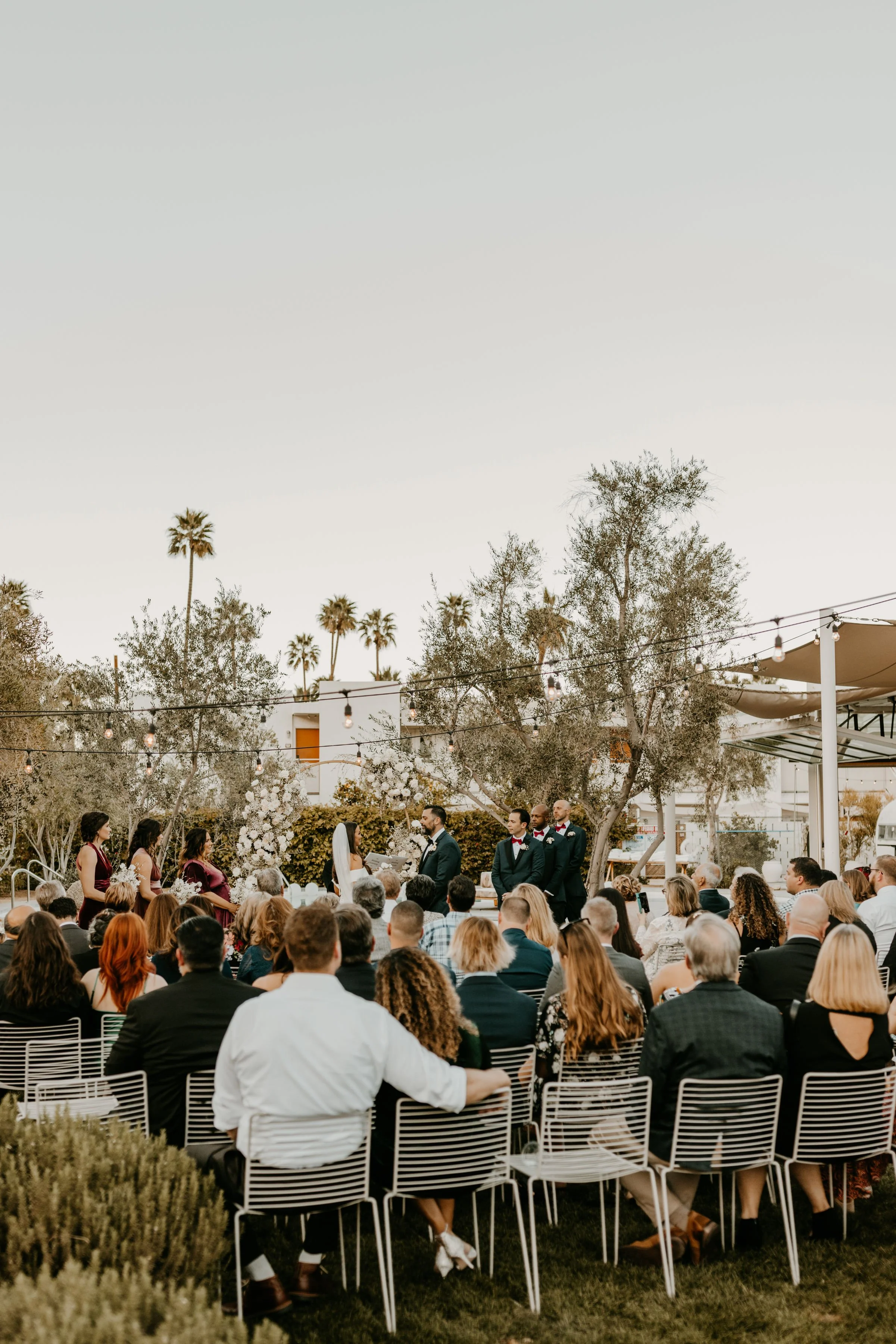
Mary + Nick tie the knot in a Sleek Palm Springs Ceremony
If you haven’t had the pleasure of visiting the Ace Palm Springs… Seriously, where have you been? This hotel is where I first took notice of the Palo Verde tree- my very favorite tree! It’s bright yellow blossoms in the spring are balanced by the fact that the entire tree turns the prettiest all over green in the winter. It simultaneously satisfies both my aversion and love of color and that is cool.
Speaking of color, these trees and every other ridiculously cool detail at this hip desert oasis made for the most perfect backdrop to Mary and Nick’s stunning wedding.
Vibe // Minimal, clean, sophisticated + romantic. Colors // white, black + sandy neutrals.
Still Carnations created sculptural arrangements of white roses and baby’s breath to adorn the welcome sign, seating chart and ceremony arch, greeting guests with a black and white delight. This sleek and industrial minimalist aesthetic was infused throughout Mary and Nick’s perfect day.
The double arched seating chart paired a bold font with hand-scripted lettering keeping with the classic black on white format. I absolutely love getting to juxtapose soft and pretty details with modern lines. Our Jude frame was the perfect accent to this pairing in my humble opinion.
The minimalist tabletop was executed with frosted acrylic table numbers, bud vases, neutral linens and modern white cotton place cards with a bold san serif typeface.
We showcased Mary and Nick’s favorite cocktails with a chic arched bar menu and some fun line drawing illustrations. One of my faves!
If you are looking for more desert wedding inspiration, Weddings By Sabrina for delivers some serious Joshua Tree eye candy!
Venue || Ace Hotel Palm Springs
Planning + Design || Weddings by Sabrina
Signage + Paper goods || Paper Cliché
Photography || Kellie Jane Creative
Florals || Still Carnations


